With the turn of a New Year that has already produced a new president and millions of women marching around the world for social justice, 2017 is certainly starting off interestingly enough. But what does that mean for art and design in 2017? What new trends can we expect?
Reachability with a great customer experience
The strength of social media has been steadily growing since its infancy (remember the heyday of MySpace). It provides quick access to both the masses and specific target audiences while not having to pound the pavement to have great results. Social media links are on everything from websites, emails and even print. And then there are QR codes which will take users directly to specific products or information on the web.
But once an individual gets to their destination, how interactive is their experience? Are they met with moving or stagnant objects? Are they allowed to freely voice their opinion and become involved in your company or are they simply reading a couple of lines of text and then moving on. The greater the customer experience, the stronger the bond between the consumer and the company.
Every January, Pantone releases its color of the year which they feel reflects the cultural climate of the coming year. Last year, for the first time, they chose two colors that psychologically fulfill our yearning for reassurance and security: Ruby Quartz (13-1520) & Serenity (15-3919). For 2017, Pantone chose Greenery (15-0343) which represents fresh beginnings, Spring, a new way of looking at the world. According to Pantone, Greenery, “Greenery signals consumers to take a deep breath, oxygenate and reinvigorate.”
The virtual Experience
Towards the latter part of 2016, people have been showered with advertisements on virtual reality (VR) products. From video games to cellphones, companies are working hard to provide their customers with new and innovative experiences. Leading the pack in hardware are Playstation & Samsung but everybody is jumping on board when it comes to software. Six Flags plans on making virtual roller coaster rides. StubHub is creating a virtual look so that customers may know what a view from their seats before they purchase the tickets. Every industry from medical to hospitality services are making the leap to VR.
Simplicity is the key to success
“Less is more” is something we all have heard while moving through the ranks of art and design schools and this has especially been true when it comes to logo design. But now more than ever, companies are streamlining all of their design practices to strictly focus on simplicity vs. lavish designs. Expect companies to be removing rather than adding visual elements in their branding and marketing campaigns.
Products and packaging
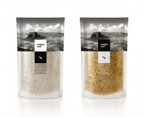
To piggyback off the above section on simplicity, package design will focus on what is inside the package vs. the package itself. Pretty wrapping is being taken over by a more transparent, simple design that emphasizes the product itself. It brings more of a connection to the consumer enabling them to feel like they are getting something very valuable instead feeling like they are receiving a cheap Cracker Jack prize since they can see exactly what they are receiving. This could not be more evident than in food packaging. Transparent bottles and easily readable ingredients emerge as we become more concerned with where our food or product has come from and the process involved in production and manufacturing.


