Logo design
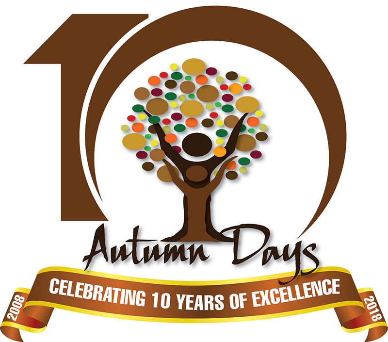
The logo is a celebration of healing through family. The tree trunk represents uplifting through the organization & its services while the circular leaves represent the many family members willing to help. Warm/calming colors were used to give potential clients a sense of welcoming as well as donors, a sense of old-school reliability and dependability.
Their current design represents their 10th Anniversary of stability and success with its contemporary number 10 and its classic ribbon.
- Client: Autumn Days
- Local: Ohio
- Skills: Illustrator
- Website: http://autumndays.org/


